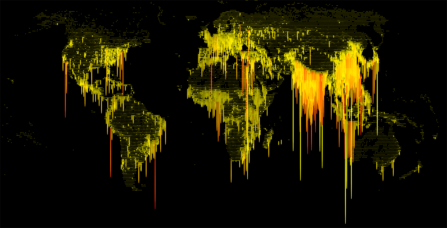
Human Ooze Map: A Unique Look at Population Density
We’re used to seeing these population density charts in the traditional “upwards” orientation. This map via Reddit user “restricteddata” shows population density in a new light. As humans “oozing” out of the earth, with some rather unflattering colours!
The data used is from the LandScan ambient population database which shows the estimated population density in a given 24 hour period. The length and colour indicate the denser areas (darker + longer = denser)

The map shows huge spikes (or oozes?) in the places you would expect, big cities, business hubs and countries with a naturally high population density like India and China. And a few other interesting big oozes around the world.

