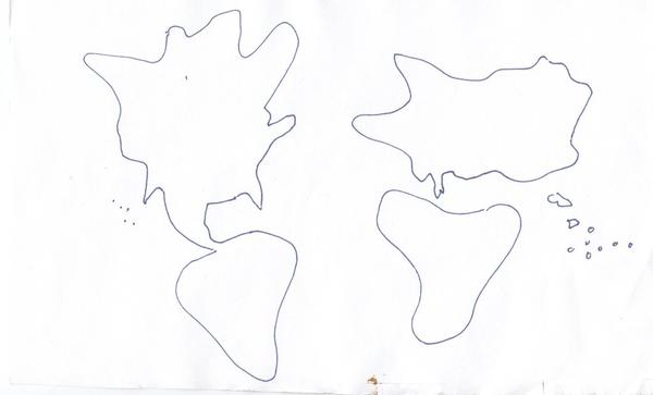
Map of the World According to 30 American University Students
Could you draw a map of the world from memory?
Well that’s exactly what these 30 students from University of Michigan, USA did when asked by Redditor “zaaakk”
The results were then digitally combined to give an average map of the world. Some countries are exaggerated, some have shrunk, and some are just not there at all!

Via Reddit user zaaakk
Winners
- North America (no surprises there)
- Central America!! – by a factor of about 10.
- The Middle East
- A new country we’re calling Eurussia
- Australia. Looks like it ate New Zealand
Losers
- New Zealand. Sorry…
- The United Kingdom!
- The poles..
- Ireland
- Iceland
- Papua New Guinnea, Indonesia, the Philippines, Singapore, Malaysia….you know what? Pretty much every island nation has disappeared into the sea.
It’s not surprising when you look at some of the original drawings, which range from pretty good…

….to pretty bad…..

Oh dear….
Here’s the full list

